Positive Approaches Journal, Volume 9, Issue 3
| Site: | My ODP |
| Course: | My ODP |
| Book: | Positive Approaches Journal, Volume 9, Issue 3 |
| Printed by: | |
| Date: | Sunday, June 28, 2026, 12:26 PM |
Positive Approaches Journal | 5

Volume 9 ► Issue 3 ► 2020
Introduction
Data is all around us and the ways we use data have an important impact on how our world is changing. In this issue of Positive Approaches, we bring you a wide array of approaches to how people are thinking about, using, and displaying data. Woven into each article are tools to help you find data sources, use data, and interpret data in new ways.
We have engaged authors who are experts in coding data, on-the-ground clinical practice, and in policy to display the different ways people are thinking about and using data. Sometimes new ideas about data can come from sources that are well outside your specific area of expertise or interest and being open to adapt approaches in new ways is innovative and can bring new advancement to the table.
Pushing boundaries is critical to ensuring we are moving toward best practice for the individuals we all strive to support and serve. The articles included in this issue aim to spark new approaches to data as well as provide the resources needed to execute your own data analysis.
— Lindsay Shea, MS, DrPH and Kate Verstreate, MPH
Alford | 6-11
Volume 9 ► Issue 3 ► 2020
Exploring the
Components of Quality Visualizations
Amy Alford, M.Ed., BCBA
Introduction
“Visualizations act as a campfire around which we gather to tell stories.”1 Imagine sitting around a campfire with friends and family and before you know it, several hours pass by. What would keep you at the fire for so long? Would it be the ambience of the flame shining brightly through the night sky, the quality of the firewood to maintain that flame, the skills of the person who built the fire, or perhaps the people you were sitting with to enjoy laughter and conversation (and maybe a s’more or two)? What if the fire dwindles after a few minutes or no one stays there to tend to it? Would you be motivated to sit and talk for hours or would you call it an early night?
A quality visualization, whether from an Excel spreadsheet or a dashboard in Tableau2 represents the foundation to draw people close to hear the story of the data being told, much like that campfire. It begins with someone who has the skills to build a visualization to draw you in as a reader. Even if you are experienced in your ability to use and analyze information, data visualization adds value to our understanding of the world around us. 3 The purpose of this article is to highlight several tips and recommendations for a) recognizing the components of high quality visualizations, b) understanding how to read and interpret visualizations, and c) sharing and disseminating the information to continue to tell the story.
Recognizing the Components of High-Quality Visualizations
1. Similar to the five principles of Gestalt,4 quality visualizations should contain clear explanations of data elements and labels, carefully selected icons/graphics, and appropriate placement of graphs and charts. It should be packaged in a way that makes it easy for the reader to interpret without much additional explanation. Poorly designed visualizations filled with too much clutter, unclear labeling, or unique representations of the data unfamiliar to the reader will not have great impact.
2. Often, there are multiple ways to represent the same data to allow you the opportunity to interpret the information in different ways. Check out the Gallery on Makeover Monday5 to see how others take one data source and create multiple visualizations from their unique perspectives.
Understanding How to Read and Interpret Visualizations
1. To read a visualization you need the right technology. Programs including Microsoft Excel or Tableau Reader6 provide the reader the ability to manipulate the information from a variety of devices. Many of these programs also have mobile interfaces and can be embedded into social media with just a click of a button.
2. Read a visualization like a book. Start at the top and move left to right. Pay attention to the title and look for captions or summary statements near each visualization; Icons or other tool tips,7 including legends, axes, and directions from the author may also provide you with additional guidance for how to interact with the data.
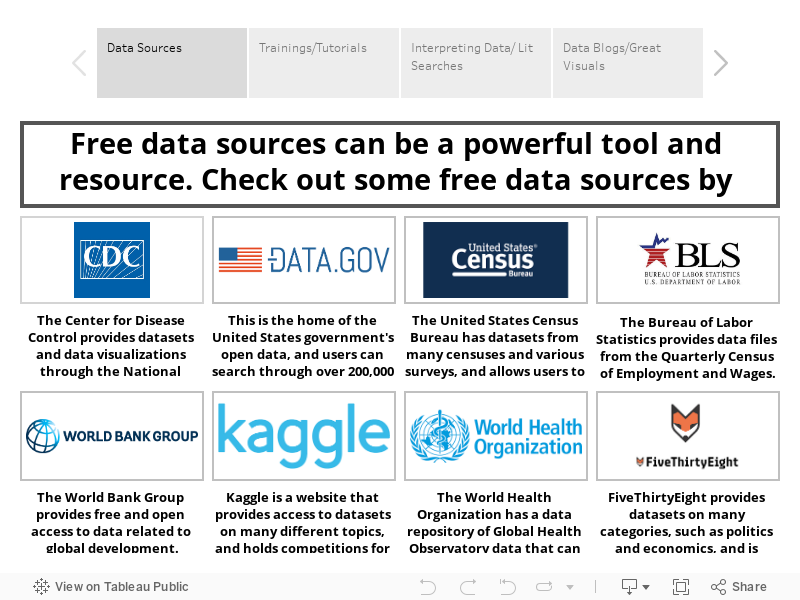
3. Hover, click, and explore your way through each element in the visualization. Often what you see on the surface is only the beginning. Authors may add icons or arrows to tell users where and how to click and hover. For example, the World Shape visualization,8 allows you to compare countries to the world by manually dragging the slider across years or pushing play to automatically view the change over time. This visualization also pulls specific facts about each country you select within the same visualization.
4. Filters are a feature within the visualization software that are designed to narrow your focus on specific elements of a visualization that are of interest to you. Use filters to compare elements (e.g. dates, counties) to an entire data set or to sort the data (e.g. population, sales) in a different way. Tableau Public provides many examples of visualizations with a variety of filters. One dashboard in particular highlights Pennsylvania Home and Community-Based Services9 where several filters including service category, fiscal year, county, and enrolled service users can be applied to the graphs within the visualization, resulting in immediate change as you explore the data.
5. Pay attention to color schemes as they may provide you with critical information to draw your attention. Eva Murray10 explains the importance of color in data visualizations to create an impact through our emotions and to create different associations with the information being shared. As you apply different filters, notice how colors change the view.
6. For additional tips on how to understand and interpret a visualization, check out Diana Aleman’s11 six tips on reading a visualization, where she breaks down the components to help visualizations feel less daunting and intimidating.
Sharing and Disseminating the Information to Continue to Tell the Story
1. Share with others! Creating a visualization using the best practices described above is only the first step. Dissemination is key to encourage others to explore the information. While some visualizations can be emailed, others may require specific software. For example, if you receive a visualization created in Tableau Desktop, you will need Tableau Reader6, on your device. Tableau Reader is a free application that allows you to present views as a slideshow, filter, drill down, export or print views of the data, and/or publish as PDF file.12
2. Data should make you ask more questions. Reach out to the author or creator of the visualization with questions or takeaways. It may open up conversations to explore the data in other ways.
3. Check back
frequently. While some visualizations are an extract, or a one-time snapshot of data, many visualizations are updated at regular intervals. Be sure to check back on the visualizations to see the change over time to the visualization.
References
1. Shalloway A. CEO of Net Objectives.
2. Tableau Software, LLC website. https://www.tableau.com/. Accessed October 23, 2020.
3. Zote, J. Data visualization: What it is and how it adds value to marketing. Sprout Social, Inc. website. https://sproutsocial.com/insights/data-visualization/. Published April 30, 2020. Accessed October 23, 2020.
4. Thompson, G. The 5 Principles of Gestalt. Sciencing website. https://sciencing.com/5-principles-gestalt-8430201.html. Published April 24, 2017. Accessed October 23, 2020.
5. Gallery. Makeover Monday website. https://www.makeovermonday.co.uk/gallery/. Accessed October 23, 2020.
6. Tableau Reader. Tableau Software, LLC website. https://www.tableau.com/products/reader. Accessed October 23, 2020.
7. How to create visual tooltips. Tableau Software Resources website. https://www.tableau.com/about/blog/2016/5/how-create-visual-tooltips-53910. Accessed October 23, 2020.
8. Compare countries through their shape. Worldshapin website. http://worldshap.in/#/AR/. Accessed October 23, 2020.
9. PeopleStat. Pennsylvania Home & Community-Based Service Programs for Persons with Intellectual Disabilities. Tableau Public website. https://public.tableau.com/profile/peoplestat#!/vizhome/RevisedODPDashboard_0/Dashboard1. Updated May 24, 2018. Accessed October 28, 2020.
10. Murray E. The Importance of Color in Data Visualizations. https://www.forbes.com/sites/evamurray/2019/03/22/the-importance-of-color-in-data-visualizations/#7b6cc99957ec. Published March 22, 2019. Accessed October 23, 2020.
11. Aleman D. Tips on interpreting data visualizations. Method Space website. .https://www.methodspace.com/tips-on-interpreting-data-visualizations/. Accessed October 23, 2020.
12. Tableau Reader Help. Tableau Software, LLC. https://help.tableau.com/current/reader/desktop/en-us/reader_welcome.htm. Accessed October 23, 2020.
Biography
Amy is a Senior Clinical Consultant for the Bureau of Supports for Autism and Special Populations (BSASP), Office of Developmental Programs (ODP). She has been supporting children, adolescents, and adults with autism and other developmental disabilities for over 15 years in community, home, and school settings. She holds a master’s degree in Special Education and in 2011, became a Board-Certified Behavior Analyst (BCBA). Prior to joining the clinical team in 2008, Amy was a Behavioral Specialist for a provider in the BHRS (now IBHS) system. She holds a Tableau Creator License to develop data visualizations and spends much of her time leading training efforts across ODP. Amy continues to apply principles of Positive Behavioral Supports and Applied Behavioral Analysis throughout her work.
Contact Information
Amy Alford, M.Ed., BCBA
PA Office of Developmental Programs
(717)-215-9659
Brusilovskiy & Salzer | 12-19
Volume 9 ► Issue 3 ► 2020
Using Global Positioning Systems to Assess Community Mobility and Participation of Individuals with Disabilities
Eugene Brusilovskiy & Mark S. Salzer
Background
Community inclusion and participation are essential for the health of people with disabilities.1 Community mobility, defined as “locomotion in environments outside the home”2 is often needed for community participation.3,4 Global Positioning Systems (GPS) offers a novel approach for understanding the extent to which people with disabilities are getting out of their homes and moving about their communities. The purpose of this paper is to 1) provide a brief overview of GPS tracking, 2) describe mobility variables from GPS data, and 3) briefly summarize some key findings of our GPS research.
Using GPS to Track Mobility of Individuals with Disabilities
There are numerous GPS devices that can be used to track the mobility of individuals with disabilities. Some include handheld GPS transmitters that can be worn or carried, such as watches, keychains, pocket-size trackers, or GPS-enabled smartphones. Data can be downloaded from these devices or sent in real-time via WiFi or cellular transmissions. Data includes latitude, longitude, and sometimes altitude, and tracking can be to the minute, which could lead to up to 1440 data points per day and 10,080 in a week. There are often two major concerns with GPS data collection, briefly described below.
Missing Data Concerns
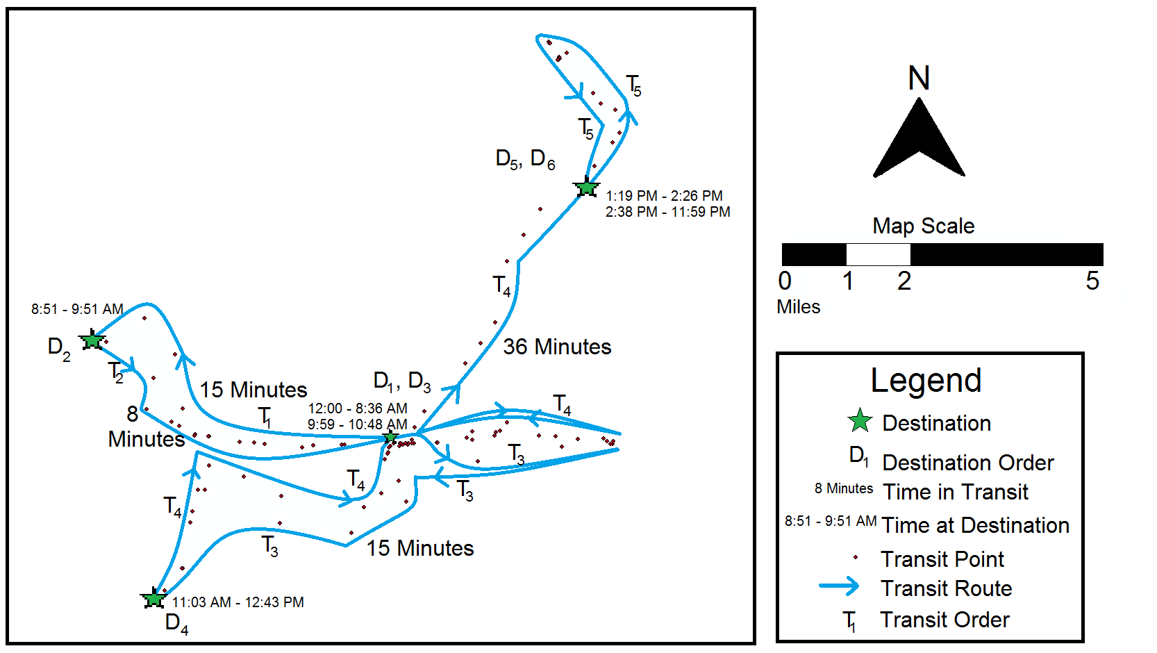
GPS data are messy, and a lot of cleaning needs to happen before any constructs can be computed. For instance, because GPS reception only works when the phone is outdoors or close to a window, when an individual is indoors, GPS data will be missing and will need to be imputed. We developed an algorithm for dealing with missing data which is described in detail in Brusilovskiy, Klein, & Salzer (2016)5. Figure 1 shows an example of what GPS points look like once put on a map with consecutive destinations denoted by D and transit to other destinations indicated by T, along with time stamps.5
Figure 1. Visualization of GPS Data5
Ethics Concerns
Another key concern is the issue of ethics and privacy around GPS data collection. Although GPS tracking may seem intrusive, it is important to keep in mind that only the location is being recorded, and not what the individual is doing at that location, or who she is with. Storing data on a secure, password-protected HIPAA-approved server, and making sure that any maps that are published do not disclose the identity of the participant through reverse geocoding or other means are some additional ways to mitigate privacy-related concerns. Lastly, it is very important to have a detailed consent form which ensures that participants understand what GPS tracking entails, as well as the risks and benefits of participating in the study. In our experience, the majority of individuals with serious mental illnesses and autism-spectrum disorders were interested in participating and did not express concerns about issues related to privacy.
What Mobility Constructs Can We Measure Using GPS?
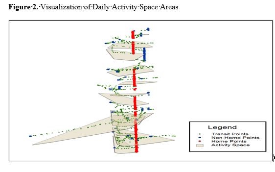
As can be seen in Figure 1, 5 GPS allows us to track numerous things related to mobility, including the total number of destinations someone goes to, number of non-home destinations, and number of unique destinations. This information tells us about how many places people visit and the diversity of places they visit. We can also examine how much time people spend at home and outside of the home, and drill down to time spent in-transit and at each non-home destination. This data can also allow us to calculate the percentage of days they never leave their homes (we might refer to people who spend a large percent of days at home as homebodies) or times of the day when they are more likely to be active outside of the house. Finally, we can examine Activity Spaces, which are defined as “local areas within which people move or travel during the course of their daily activities.” 6,7 Having larger areas to move around may increase people’s opportunities to engage in different types of activities. Figure 2 below shows daily activity space areas for a hypothetical person. Each polygon in the figure represents an activity space for a different day in the study period. The activity spaces in the figure appear to be vertically stacked on one another; this is because in this figure, the vertical axis represents time. Hence, the polygon at the very bottom of the figure represents the activity space for the first day of tracking, the polygon above it represents the activity space for the second day, and so on. Red points show the times that the individual was at home, blue points show the times that individuals spent at non-home destinations, and green points are transit points. This figure enables us to visualize the variability in activity space area by day, as well as the presence of a potential routine if activity space areas on certain days have similar sizes and shapes.
In addition to activity space, we can calculate the total distance they travel over the course of the study period and, for example, the % of days on which the individual traveled distances above or below certain thresholds (less than 1 mile, more than 10 miles, etc.).
What We Are Examining Using GPS
We have carried out several studies which tracked individuals with serious mental illnesses with GPS. One study (Brusilovskiy et al., under review), examines the relationship between the GPS-derived mobility constructs described above and self-reported
measures of community participation. We found that individuals who had more destinations and spent more time out of the house reported greater levels of community participation.
These findings were consistent with the premise that community mobility is a prerequisite for community participation. A second study (McCormick et al., under review), found that spending many more days at home was associated with lower neurocognitive functioning among adults with serious mental illnesses. While it may be the case that neurocognitive functioning may lead people to be more likely to be homebodies, there is substantial research suggesting that environmental deprivation, including possibly spending most of your time at home, can both prevent cognitive development or lead to cognitive decline. A third GPS study,9 examined whether individuals had greater community mobility on days they received services at their community mental health centers. We found that individuals had more unique destinations and time spent out of home on CMHC days than on non-CMHC days, which suggests that scheduling and attending healthcare appointments may have ancillary benefits of getting people out of their homes more. A fourth GPS study,10 shows that individuals who have more destinations and spend more time outside of home have higher levels of moderate-to-vigorous physical activity, lower levels of sedentary activity, and more steps per day. Future studies will look at the relationships between the GPS mobility variables and psychosocial outcomes, physical health outcomes, as well as indicators of the social, built and natural environment.
Conclusions
Using GPS to measure community mobility of individuals with disabilities is an area of increasing interest to researchers, health service providers, and policymakers, for understanding people’s lives in the community. Emerging findings suggest that supporting people in getting out of the house and moving about their community may have positive benefits for their physical, cognitive, and mental health and wellness.
Acknowledgment
The contents of this article were developed under a grant from the National Institute on Disability, Independent Living and Rehabilitation Research (NIDILRR; Grant # 901F0065-02-00; Salzer, PI). However, the contents do not necessarily represent the policy of the U.S. Department of Health and Human Services, and endorsement by the Federal government should not be assumed.
References
1. Salzer MS. Community inclusion and social determinants: From opportunity to
Health. Psychiatric Services. Rin Press.
2. Patla AE., Shumway-Cook, A. Dimensions of mobility: defining the complexity and difficulty associated with community mobility. Journal of Aging and Physical Activity. 1998;7:7-19.
3. Gattinger H, Senn B, Hantikainen V, Köpke S, Ott S, Leino-Kilpi, H. Mobility care in nursing homes: Development and psychometric evaluation of the kinaesthetics competence self-evaluation (KCSE) scale. BMC Nursing. 2017;16(1):67.
4. Poole JL, New A, Garcia C. A comparison of performance on the Keitel Functional Test by persons with systemic sclerosis and rheumatoid arthritis. Disability and Rehabilitation. 2018;40(21): 2505-2508).
5. Brusilovskiy E, Klein LA, Salzer MS. Using global positioning systems to study health-related mobility and participation. Social Science & Medicine. 2016;161:134-142.
6. Axhausen, KW, Rai RK, Rieser M, Balmer M, Vaze VS. Capturing human activity spaces. ETH, Eidgenossische Technische Hochschule Zürich, IVT, Institut für Verkehrsplanung und Transportsysteme. http://dx.doi.org/10.3929/ethz-a005237115.
7. Rai RK, Balmer M, Rieser M, Vaze VS, Schönfelder S, Axhausen KW. Capturing human activity spaces: New geometries. Transportation Research Record. 2007;2021(1):70-80.
8. Brusilovskiy E, Klein L, Townley G, McCormick B, Snethen G, Salzer MS.. Community mental health center as a community participation affordance: Comparing visit days and non-visit days. Presented at APHA's 2019 Annual Meeting and Expo; November 2019; American Public Health Association.
9. Snethen G, Brusilovskiy E, Klein LA, McCormick B, Salzer MS. Community mobility and participation are associated with greater physical activity among individuals with schizophrenia-spectrum disorders. Presented at APHA's 2020 Annual Meeting and Expo; October 2020, American Public Health Association.
Biographies
Eugene Brusilovskiy is the Director of the Laboratory on Geography, Mobility and Disability at Temple University. He has served as co-investigator on numerous NIDRR-funded grants and has co-authored dozens of peer-reviewed manuscripts. His research interests include the use of innovative technologies and analytical tools to measure community mobility, community participation, and physical activity of individuals with disabilities, and examine how these variables are related to various health outcomes.
Mark Salzer, Ph.D. is a psychologist and Professor of Social and Behavioral Sciences in the College of Public Health at Temple University. He is also the Principal Investigator and Director of the Temple University Collaborative on Community Inclusion of Individuals with Psychiatric Disabilities, a rehabilitation research and training center funded by the National Institute on Disability, Independent Living, and Rehabilitation Research since 2003. Dr. Salzer’s research focuses on community inclusion and participation.
Contact Information
Eugene Brusilovski
eugeneby@gmail.com
Mark Salzer
mark.salzer@temple.edu
Koffer-Miller | 20-27
Volume 9 ► Issue 3 ► 2020
Words are Data Too! Options for Analysis and Visualization
Kaitlin H. Koffer Miller, MPH
Introduction
When the word “data” is used, it informally conjures an image of Excel sheets, strings of numbers, bar graphs, and scatter plots. But that is only one form of data: quantitative data. Quantitative data are numeric and can be counted, measured, and analyzed for cause and effect.1 Qualitative data, on the other hand, are non-numeric and can be analyzed to understand context and meaning of themes, opinions and perspectives.2 Qualitative research by nature, “…is interactive: context dependent; holistic; flexible; evolving; inductive and descriptive. It has as its foci, perspectives, meanings, uniqueness, and subjective live experiences. Its aim is to provide understanding”. 3 Qualitative data is most useful when you are trying to learn more about a specific issue and trying to gain a deeper understanding beyond counts and other numeric measurement.
Qualitative data can be collected from a myriad of qualitative methods including interviews, focus groups, and surveys. Interviews are one of the most commonly used qualitative methods and can be structured, semi-structured, or unstructured. 4 Structured and semi-structured interviews rely on a set of questions that the interviewer asks the respondents while the less commonly used unstructured interviews “…resembles a conversation more than an interview”.4 Focus groups are similar to an interview, but with a group of around six-twelve people participating in a semi-structured discussion facilitated by a session moderator. 4, 5 Surveys can have both quantitative and qualitative components, meaning that a survey can include questions that can be counted (e.g. the number of providers who offer a certain service, a scale of how satisfied staff are with a communication strategy) or questions that are more free-text in nature and offer a space for respondents to freely share their thoughts (e.g. a text box for suggestions for future training topics).6
In all of these qualitative methods, the common thread is that the words reported by interviewees or focus group participants, either written or spoken and transcribed, are the data. Exploring and effectively displaying words as data can be a tremendous tool to better understand issues of interest.
Exploring Words as a Data Source
There are many ways to explore and begin to understand words or “textual data”. One way is called “coding”. Once you have your textual data (e.g. transcriptions from audio recordings of interviews or focus groups, free text responses from a survey), you are ready to explore. Coding is essentially looking for themes in the data assigning words or phrases to quotes, passages, or other aspects of your textual data.7 For example, if you have a quote from an interview about office processes that states, “I think that the emails we get are too long”, you may code that as “Email Length”, “Emails too long”, or if you think you could not have said it better yourself you could code it as “I think that the emails we get are too long”. This typing of coding is called “in vivo” coding.8 Your codes can be in whatever style you and your team find most helpful to understand. Coding can be done in many ways using many methods and types of software. You can either pre-determine codes (deductive coding) or determine codes as you read your textual data source (inductive analysis).7, 8 This can be done using a paid qualitative analysis software like NVivo or Dedoose or even using highlight and the comment functions in word processing software like Microsoft Word.
Once you read through and assign codes to all of your textual data, you will have a list of codes that are the themes. You can consolidate your codes into a smaller set of themes if you have some codes that are similar.8 For example, if you have codes from a survey completed by staff about training needs and you have a set of codes like “Sexuality,” “Sexual Relationships,” “Dating,” and Relationships” you may want to group all of those codes into one code called “Sexuality and Relationships” to encompass all of the text that related to those topics. This will help you have a smaller number of themes to describe. Once you have gone through the exercise of consolidating your codes into themes, you will have a list of themes and be able to see how many times that theme was discussed, by how many people, and how it related to or was discussed or mentioned with other themes.
You can also look at word frequency in your textual data. This process is more simplistic than coding the content for themes.9 Word frequency is counting the amount of times that a word appears in the data source.9 Similar to coding, word frequency counts allow you to determine themes based on the number of times a word appears in your source (e.g. transcript or compilation of free text survey responses). Like coding, this can be done using paid qualitative analysis software or using programs like Microsoft Word or Excel. You could use your findings to report on as themes (to be described later) or as a springboard to look into specific themes more deeply. For example, if the word “support” comes up frequently in a series of interviews about family engagement with home and community based services, you may want to look more specifically at how the word “support” was being used and if there are more than one type of support being discussed. Perhaps your second review reveals a discussion of formal support versus informal support and you would want to report on these two findings separately.
Data Visualizations for
Words
There are many ways to use visualizations to effectively display your findings from your textual data. Word clouds are an excellent way to visualize words as a data source. Similar to word frequency analysis, word clouds allow you to “quantify” your
textual data “…to increase comprehension and accessibility through visualization of the written responses”.10 Word clouds are a visualization that increase the size and/or boldness of a word based on the number of times it appears in the
data source (e.g. free response text from a survey or interview transcript).10 This allows viewers to easily interpret and understand what were commonly reported ideas, thoughts, or themes from your survey, interviews, or focus groups.
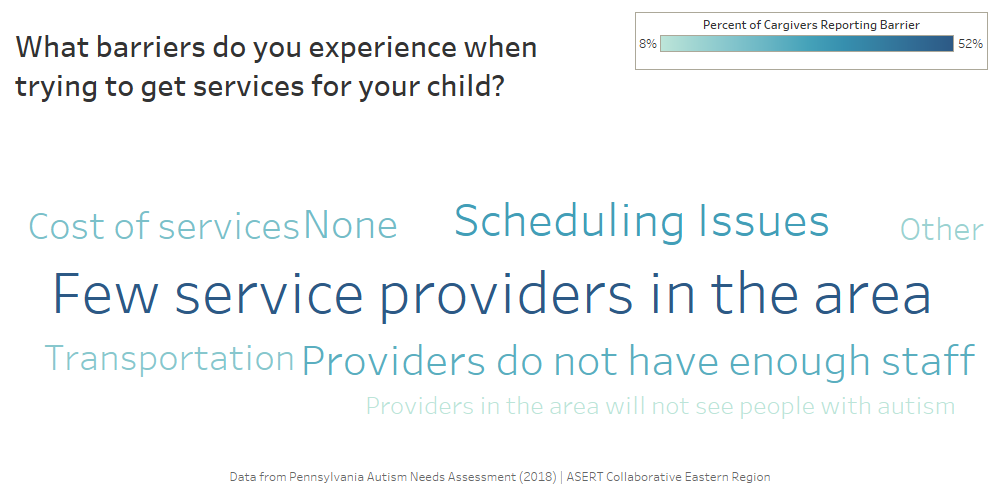
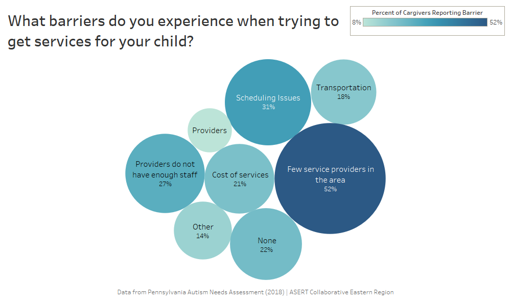
Word clouds can be done using paid software like Tableau, a data visualization software, or in free online options like Wordle. The following example of a word cloud (Figure
1 below) has been created in Tableau using responses from a question about barriers to services as reported by family members and caregivers of autistic individuals from the 2018
Pennsylvania Autism Needs Assessment. This word cloud shows that “few service providers in the area,” “scheduling issues,” and “providers do not have enough staff” were commonly reported barriers to services by family members and caregivers of autistic
individuals. While this data could have been described in a narrative form or using percentages, the word cloud provides a visual opportunity to easily displace your textual data in a report or presentation.
Figure 1: Tableau Word Cloud Example
Another data visualization to display your textual data, like a word cloud, is a bubble graph. The word map uses the size of a bubble and includes a frequency (like a percentage) to display words, themes, ideas, or concepts that were most frequently reported in your data source. Word maps can be done in paid software like Tableau or using a word processing software like Microsoft Word or a presentation tool like Microsoft PowerPoint, however the visualizations you would create by hand in Word or PowerPoint would not have the same precision of size and shape as Tableau which would automate this based on the data. The following example (Figure 2 below) uses the same textual data from the 2018 Pennsylvania Autism Needs Assessment about services barriers. This data visualization again provides an easily interpretable way to see what is commonly reported by respondents, interviewees, or focus group respondents.
Figure 2: Tableau Data Visualization Example
Conclusions
There are many options for you to analyze, interpret, and visualize your textual data from surveys. Once you have collected your textual data, it is important to ensure that your findings are easily translated and viewed by your audience. Qualitative research and analysis of textual data can often be displayed in cumbersome narrative reports that do not captivate readers or viewers, but data visualization can be created using free and paid tools that can enhance and sophisticate the way that you present textual data. When coupled with longer quotes extracted from your data sources, data visualization like word clouds and bubble graphs can bring your analysis to the next level and remind your readers, colleagues, or audience that words are data too!
Reference
1. Australian Bureau of Statistics: Quantitative and Qualitative Data. https://www.abs.gov.au/websitedbs/a3121120.nsf/home/statistical+language+-+quantitative+and+qualitative+data#:~:text=What%20are%20quantitative%20and%20qualitative,symbol%2C%20or%20a%20number%20code. Accessed 14 September, 2020.
2. Watkins DC. Qualitative research: the importance of conducting research that doesn’t “count”. Health Promot Pract. Mar 2012;13(2):153-8. doi:10.1177/1524839912437370.
3. Trudeau-Hern S, Daneshpour M. Cancer’s Impact on Spousal Health: A Qualitative Analysis in Grounded Theory. Contemporary Family Therapy. 2012;34(4):534-554.
4. Jamshed S. Qualitative research method interviewing and observation. J Basic Clin Pharm. Sep 2014;5(4):87-8. doi:10.4103/0976-0105.141942.
5. Koffer-Miller KH, Mathew M, Nonnemacher SL, Shea LL. Program experiences of adults with autism, their families, and providers: Findings from a focus group study. Autism. 2017; 22(3); 345-356. doi:10.1177/1362361316679000.
6. Fielding J, Fielding N, Hughes G. Opening up open-ended survey data using qualitative software. Quality & Quantity. 2012;47:3261–3276.
7. Braun V, Clarke V. Using thematic analysis in psychology. Qualitative Research in Psychology. 2006;3(2):77-101.
8. Creswell J, Poth C. Qualitative Inquiry and Research Design: Choosing Among Five Approaches. 4th ed. SAGE Publications, Inc.; 2018.
9. Ryan GW, Bernard HR. Techniques to identify themes. Field Methods. 2003;15(1):85-109.
10. Bletzer KV. Visualizing the qualitative: making sense of written comments from an evaluative satisfaction survey. J Educ Eval Health Prof. 2015;12:12. doi:10.3352/jeehp.2015.12.12.
Biography
Kaitlin Koffer Miller is the Regional Manager of the Autism Services, Education, Resources, & Training Collaborative (ASERT) Eastern Region at the AJ Drexel Autism Institute. Ms. Koffer Miller’s work focuses in policy research as well as qualitative data analyses. Ms. Koffer Miller holds a master’s degree in Public Health from the Dornsife School of Public Health at Drexel University and is a doctoral candidate in Health Policy at the Dornsife School of Public Health at Drexel University.
Contact Information
Kaitlin Koffer Miller, MPH
Regional Manager, ASERT Eastern Region
A.J. Drexel Autism Institute
Drexel University
Merriweather | 28-33
Volume 9 ► Issue 3 ► 2020
Data Visualization: How to Use Graphics Effectively
Chisa Merriweather
Data can be an extremely powerful tool when its message is able to be clearly conveyed. Attempting to make large volumes of data more interesting, dynamic, and well-received by your audience is a technique called data visualization or data storytelling. Representing data in the form of visual context, such as a chart, table, graph, infographic, or a map, helps viewers understand the significance of that data. When done well, visualizations are able to shed light on obscure details that would normally be difficult to uncover in a typical spreadsheet or bar chart.
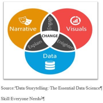
When crafting a story around data, it’s important to understand how to combine the right data, visuals, and narrative. There is a whole science behind designing effective digital visualization. For now, we’ll focus on 3 crucial elements to remember when creating data stories.
 1.
Focus on key points that stand out.
1.
Focus on key points that stand out.
2. Make smart design decisions.
3. Keep it simple.
Focusing on key points in data that stand out makes things easy for your audience.
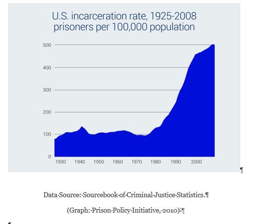
The ability to visualize differences and similarities between objects (such as size, orientation, or color) is naturally detected by the viewer. Visual metaphors, like a pyramid that displays hierarchy, or a scale used for the comparison of two things, also aid in providing a focus. The orientation and type of table used in the example below2 clearly indicates to the viewer that this information is important. At first glance, eyes are immediately drawn to the increase in U.S. incarceration beyond the year 2000.
Next, you want your data to be presented in its most optimized form but most of all make sense. To ensure the functionality of the data story, smart design decisions must be considered:
1. Colors should be deliberately assigned (example: blue means cold and red means hot)
2. The order or format in which the data is presented (numeric, alphabetical, or sequential) must make sense to viewers.
3. Make sure the data is viewable. Choose a san-serif font as opposed to serif font when plotting points with a point-size no smaller than 8 points.
Finally, keep it simple. The collective of data visualization is to convey a clear message. So, simplify your chart so that the main point is the highlight of the graphic. Here are a few easy ways to accomplish this:
- When using color make sure there’s a contrast between colors. Data may seem to blend when too many shades of a similar or one color is used.
- Remove any unnecessary copy, illustrations, drop shadows, etc.
- Avoid using 3D charts that risk skewing data perception
- Patterns such as stripes and polka dots used to highlight important data, are more distracting than helpful
- The less colors used the better. Limit the color pallet to 6 colors.
Data visualizations communicate data findings that may not translate clearly through a simple bar chart or line graph. When data and visuals are successfully combined, insight and interesting patterns within the data are suddenly revealed. Data storytelling engages, informs and above all has the potential to influence change.
For more examples of data visualizations:
Best Data Visualizations of 20194
References
1. Dykes B. Data storytelling: The essential data science skill everyone needs. Forbes. 2016. https://www.forbes.com/sites/brentdykes/2016/03/31/data-storytelling-the-essential-data-science-skill-everyone-needs/?sh=6b65b68652ad
2. US incarceration rate, 1925-2008. Prison Policy Initiative website. https://www.prisonpolicy.org/graphs/incarceration1925-2008.html. Accessed October 29, 2020.
3. Barnes S. The daily routines of famous creative people. MyModernMet website. https://mymodernmet.com/podio-daily-routines-famous-creative-people/. Published January 10, 2015. Accessed October 29, 2020.
4. Velarde Orana. The 25 best data visualizations of 2019. Visme website. https://visme.co/blog/best-data-visualizations/. Accessed October 29, 2020.
5. Splitting the apple: A simple guide to understanding Apple stock splkits. Ceros website. https://www.ceros.com/originals/apple-stock-splits-2020/?utm_campaign=Ceros%7COriginals%20Newsletter&utm_medium=email&_hsmi=94143119&_hsenc=p2ANqtz-9FeUCC9u5bMeNG3Jy8ZtL-W6NYqe81mrfFGHARnlF9e0SI_KoU4MDLDwgPNrJDulsRNi5W8EhE713yb24hkwuB7_ynN6enRcWBkhLKuELzO874qGU&utm_content=94144895&utm_source=hs_email. Accessed October 29, 2020.
6. Taylor P. Next America. Pew Research website. https://www.pewresearch.org/next-america/#Two-Dramas-in-Slow-Motion. Published April 10, 2014. Accessed October 29, 2020.
Biography
Chisa Merriweather is the Communications Specialist at AJ Drexel Autism Institute. Ms. Merriweather’s design work focuses on supporting projects for the Autism Services, Education, Resources, & Training Collaborative (ASERT) Eastern Region, Philadelphia Autism Project and the Policy and Antilytic Center. Ms. Merriweather holds a Bachelor of Fine Arts degree with a concentration in Graphic Design from West Chester University and a certificate in Social Innovative Design from the University of Pennsylvania.
Contact Information
Chisa Merriweather
Schock | 34-39
Volume 9 ► Issue 3 ► 2020
Narrative-Based Data Visualizations: How Context Is Key in Making Data Accessible and Actionable
Tim Schock
Improving data literacy and data accessibility is a central mission of the Pennsylvania State Data Center (PASDC). Institutions and organizations across the state rely more heavily on data for decision-making; and the amount and complexity of data available has increased dramatically. PASDC has been at the forefront of utilizing modern data visualization techniques and technologies to improve data accessibility and data literacy.
As part of the Institute of State and Regional Affairs at Penn State Harrisburg, PASDC is part of an initiative to reduce stigma surrounding opioid use disorder (OUD) across Pennsylvania. The Douglas W. Pollock Center for Addiction Outreach and Research at Penn State Harrisburg is leading the project, while the Pennsylvania Department of Drug and Alcohol Programs (DDAP) is providing funding and additional oversight. Two national public health non-profits, Shatterproof and The Public Good Projects, are leading public information campaigns to support the goal of OUD stigma reduction.
A primary goal of this stigma reduction campaign is to educate community-based organizations (CBOs), policy makers, healthcare professionals, and community members on why addiction should be treated as a medical illness. As part of this objective, the Institute of State and Regional Affairs, comprised of the Pennsylvania State Data Center (PASDC) and the Center for Survey Research (CSR), is working with experts at Penn State Harrisburg and DDAP to identify relevant primary and secondary data indicators that would detect and measure the impact of stigma in the treatment and intervention efforts of the state relating to OUD.
The primary data, collected by CSR, includes in-depth interviews with CBOs who work with and treat individuals with OUD and a statewide baseline survey to gauge OUD stigma among the public. The secondary data indicators, collected by PASDC, include administrative data, some publicly available through Pennsylvania’s OpenDataPA initiative (data.pa.gov) and others through a data-sharing agreement between PASDC and various state agencies. Data available on the OpenDataPA site is especially convenient, as the site provides an application programming interface (API) access for datasets, allowing PASDC to connect internal data stores to these APIs, ensuring that the data driving the visualizations are up to date.
PASDC has a history of developing digital dashboards for a variety of uses and clients. PASDC has identified two main limitations of dashboards in that (1) they sometimes fail to provide context necessary to understand the data, and (2) they often fail
to communicate relevant trends. In the age of information, countless data dashboards exist on websites with little to no context. With little to no guidance, the reader must interpret the significance of the data and the main takeaways on their own.
This is not a significant burden for experts but may be overwhelming for the average user. Because the intended audience has varying degrees of data literacy, PASDC felt it was necessary to address the limitations of stand-alone dashboards.
To address these limitations, PASDC has transitioned to interactive data-driven narratives. PASDC leveraged Esri ArcGIS StoryMaps to build these data narratives with interactive charts. This format provides the end user with (1) the purpose behind the project and the selection of the indicator, (2) how to use and interact with the data visualization and important notes about the data or visualization, and (3) a summary or overview of key trends present in the data for the end user to investigate. The data visualizations were created using ArcGIS Online and Tableau Public, and both of these services are free for non-commercial use; although to get the fullest level of functionality, PASDC uses paid versions of these services, including ArcGIS Enterprise and Tableau Desktop.
CAPTION: Below is just one of five narratives being developed to address stigma using data indicators identified by Penn State and DDAP. This narrative form combines relevant literature as well as primary and secondary data to identify ways that stigma may impact treatment and intervention efforts among Pennsylvania’s first responders.1
This format has been tested a few times by PASDC in monthly reports disseminated as part of the State Data Center mission – PASDC is Pennsylvania’s official liaison to the U.S. Census Bureau, and as such is tasked with improving outreach and understanding
of the Census and it’s data among Pennsylvanians. Overall, PASDC’s audiences have greatly enjoyed the added functionality of interactive data narratives. Engagement on interactive reports is generally higher, and these items get more media attention.
The narratives developed in partnership with our colleagues at CSR, Penn State Harrisburg, and DDAP also provide a more holistic understanding of the data, combining academic literature, content expertise, and primary and secondary data to craft a
more engaging and informative narrative.
In a time where “big data” rules the world, analysis and context are critical in converting data into information and knowledge. PASDC’s internal cultural shift toward a narrative-focused data literacy will supplement data visuals with context and meaning, offering clarity to each user regardless of their ability to interpret data. As data becomes more meaningful to the average Pennsylvanian’s life, PASDC is committed to creating accessible data narratives that engage, inform, and increase data literacy among all users, regardless of their background.
Mailing List
Email pasdc@psu.edu to sign up for the Pennsylvania State Data Center Mailing List.
References
- Institute of State and Regional Affairs. Opioid and substance use stigma among Pennsylvania’s first responders. ArcGIS StoryMaps website. https://storymaps.arcgis.com/stories/a4a4baad89d946a8b783966315f2f4ed. Published September 25, 2020. Accessed October 30, 2020.
Biography Tim Schock is a data
analyst at the Pennsylvania State Data Center (PASDC). In his position at
PASDC, Tim utilizes ArcGIS, SQL, R, Python, Tableau, and more to provide data
management and data visualization on various projects with PASDC’s partners in
state government, higher education, and non-profit organizations. Tim also
coordinates PASDC’s data dissemination efforts including a mailing list with
monthly reports. Tim graduated from Shippensburg University with degrees in
Sociology (B.A.) and Geoenvironmental Studies (M.S.). In his free time, Tim
enjoys reading, board games, and exploring Pennsylvania’s farmers markets. Contact Information Tim Schock, Data Analyst Pennsylvania State Data
Center Institute of State and
Regional Affairs Penn State Harrisburg
Shea | 40-43
Volume 9 ► Issue 3 ► 2020
From the Vault: Uncovering Early Data Visualizations
Lindsay Shea, MS,
DrPH
Introduction
When we think of Florence Nightingale, most of us associate her with her founding role in how nursing has become a critical component of healthcare. Florence contributed substantively to the field of nursing through her dedication, working through the nights tending to wounded soldiers during the Crimean War. She also formed one of the first nursing schools in the world, which is today part of King’s College in London, United Kingdom (UK).
What many of us don’t know about Florence Nightingale is that she was a leading innovator in data visualization. She is credited with a new version of a pie chart, which had originally been developed by William Playfair in 1801. In the new use of the pie chart, Nightingale took data that was typically depicted as a bar chart and put it into a circular form to show how elements of data related to each other. This new pie chart, called a polar area diagram or Nightingale rose diagram was used to generate the diagram below where patient mortality in the military field hospital she managed occurred by month or season.
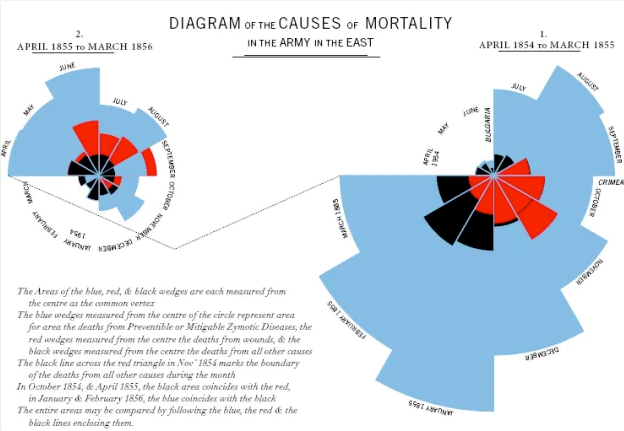 In this diagram1, mortality is tracked over time from April 1854 to March 1856, and two graphs are linked to display mortality patterns. In addition to her creativity in using data, Nightingale prioritized ways of organizing data to
ensure findings were thoroughly communicated and understood, without the use of a computer or statistical coding software. Nightingale used these polar area diagrams to present to Members of Parliament and civil servants who were not trained in
statistics to inform the course of medical care and military operations.
In this diagram1, mortality is tracked over time from April 1854 to March 1856, and two graphs are linked to display mortality patterns. In addition to her creativity in using data, Nightingale prioritized ways of organizing data to
ensure findings were thoroughly communicated and understood, without the use of a computer or statistical coding software. Nightingale used these polar area diagrams to present to Members of Parliament and civil servants who were not trained in
statistics to inform the course of medical care and military operations.
Nightingale would go on to use data visualizations to create new ways of reporting on air and water quality issues and their impact on health. Nightingale was the first female member of the Royal Statistical Society and, in 1874, she was named an honorary member of the American Statistical Association.
More than 150 years have passed since Nightingale’s polar area diagrams. Data visualization has continued to grow and emerge in new ways. By looking back into history as well as observing opportunities for data visualization all around us today, we can all contribute to new ways of using and communicating data.
Reference
1. Online Journalism Blog, 2014. Florence Nightingale and Crimean War Deaths. Is there a ‘canon’ of data journalism? Comment call!. Available at: https://onlinejournalismblog.com/2014/05/20/is-there-a-canon-of-data-journalism/ Accessed October 1, 2020
Biography
Lindsay Shea is working on efforts in Pennsylvania and beyond to implement data visualization as a way to understand and navigate the world around us. She has led research projects in Pennsylvania and nationally to identify individuals on the autism spectrum who are served across systems and specifically in the Medicaid system. Her research interests include understanding disparities in service access and use across the lifespan, especially in publicly funded safety net programs.
Contact Information
Lindsay Shea, MS, DrPH
Tao | 44-49
Volume 9 ► Issue 3 ► 2020
Getting Started With R
Sha Tao
Introduction
Data analysis is the process of evaluating data using analytical or statistical tools to discover useful information. Literally all business and all fields today need data analysis, and data-driven choices are one of the best ways to be truly confident in business decisions. In addition to traditional statistical knowledge, data analysis today largely depends on the mastery of tools for computation, exploratory analysis, visualization, dissemination, and reproducibility. There are tons of statistical software, SAS, SPSS, STATA, R, Python and MATLAB, just to name a few. They all have pros and cons and can be useful in different settings.
We will briefly introduce R here, which is a particular good programming language and free software that is widely used among statisticians.
Why people love R?
1. Free and supported on Windows, Mac, and Linux
It is hard for a beginner user to devote hundreds, if not thousands, of dollars on a software per year. R is free and is available on all main platforms.
2. Clean interface
After installing R, you usually need RStudio1, which is a set of integrated tools designed to help you be more productive with R. It includes a console, syntax-highlighting editor that supports direct code execution, and a variety of robust
tools for plotting, viewing history, debugging and
managing your workspace.
Moreover, you can save your results and code in a report-style form with notes using R Markdown2 or even create websites to share your results using R Markdown.
3. Open source
Users can expand the functionality of R through add-ons called packages, thus, all the common (and a lot of times, uncommon) statistical functions and models can be found for free either in the official packages3 or communities like GitHub4.
4. Group work
In both the academic and working environment, you might need to work with your classmates or colleagues together on a project. You can create a GitHub repository5, link all of your RStudio work to the project, and then all of you are able to edit and contribute to the project.
5. Good community
A good software always needs a good community to support it. R community creates tons of innovative discussions and packages every day, solves questions, and troubleshoots codes. Two good places for statisticians to study, share, and contribute are stack overflow 6 and GitHub4.
6. Online study
Due to the wide acceptance of R, many online classes and tutorials are there for you to explore, often for free. They can be as broad as “how to do survival analysis in R,” and can also be as detailed as “how to change font of a plot title”.
7. Extensive data visualization
There are great packages and flexible tools for creating custom graphs and tables. Also, through R Shiny (an R package), you’re able to make interactive plots and dashboard for others to explore.
There are few tips for beginners to make the most R:
1. R is evolving, and we should keep up.
Because of the advantage of an open-source software, new packages are coming out every day, and we should always embrace new possibilities. When you first learn R through an online source, don’t forget to check the time that resource was published. Many R self-learners may end up using the base() package to do data wrangling and plot() to do visualization, which is not wrong, but loses efficiency and customization possibility. I suggest using tidyverse() as a start, which contains both dplyr() and ggplot2().
2. Coding style is important.
Good coding styles7 help reduce the errors and make it easier for others to understand. In addition, always make comments of the code blocks to remind yourself the function of the codes. People understand what they write at the moment, but not two months later.
3. Understand your code before using it.
A common mistake for a beginner user is to use the function they found without understanding what it is. It probably will not hurt if you are just doing the data wrangling part; however, statistical analysis will be doomed. Have you read the package documents? Have you checked
the model assumptions? Have you addressed the flaws of the model? Have you tested the model fit? These are some of the questions you always need to ask yourself before using a function.
4. A great function, piping (%>%).
You have many commands to use regularly for data manipulation and cleaning. You may define intermediate datasets or nest function calls. However, both of them are not optimal: the first gets confusing and clutters your workspace, and the second has to be read inside out.
Piping solves this problem. It allows you to turn the nested approach into a sequential chain by passing the result of one function call as an argument to the next function call.
5. Here is a great resource that covers most of the basic use of R by Kevin Donovan, Data Analysis and Processing with R Based on IBIS Data 8.
References
1. Rstudio | Open source & professional software for data science teams. Rstudio website. https://rstudio.com/. Accessed November 3, 2020.
2. R markdown. Rmarkdown.rstudio website. https://rmarkdown.rstudio.com/. Accessed November 3, 2020.
3. The Comprehensive R Archive Network. Cran.r-project. Website. https://cran.r-project.org/. Accessed November 3, 2020.
4. Github: Where the world builds software. GitHub. https://github.com. Accessed November 3, 2020.
5. Github And Rstudio. GitHub Resources website. https://resources.github.com/whitepapers/github-and-rstudio/. Accessed November 3, 2020.
6. Stack Overflow - where developers learn, share, & build careers. Stack Overflow website. https://stackoverflow.com/. Accessed November 3, 2020.
7. Google’S R style guide. Github website. https://google.github.io/styleguide/Rguide.html. Accessed November 3, 2020.
8. Donovan, K. Data analysis and processing with R based on IBIS data. Bookdown website. https://bookdown.org/kdonovan125/ibis_data_analysis_r4/#preface. Accessed November 3, 2020.
Biography
Sha Tao is a Data Analyst working at A.J. Drexel Autism Institute Policy and Analytics Center (PAC). Mr. Tao mainly recommends, develops, and tests statistical approaches, data visualization, and efficient codes for use in both smaller-scale survey data and large-scale national databases. Mr. Tao had his undergraduate study in Biochemistry and Molecular Biology at Michigan State University. He holds a master’s degree of public health in biostatistics and a certificate in advanced epidemiology from Columbia University.
Contact Information
Sha Tao
Data Analyst
A.J. Drexel Autism Institute Policy and Analytics Center
Verstreate | 50-55
Volume 9 ► Issue 3 ► 2020
COVID-19
Data Visualization Highlight
Kate Verstreate, MPH
Introduction
The sense of uncertainty that has accompanied the COVID-19 pandemic has led our global community to turn to data. Over the past several months you may have found yourself regularly asking the following questions: How many cases are in my county? How does my state compare to the rest of the country? Or simply, Should I be concerned? News outlets and social media streams have been flooded with heat maps and bar charts depicting data related to the pandemic. With such an influx of information and data surrounding COVID-19, data visualizations are here to help make sense of it all.
As COVID-19 cases rose in late March, we also saw a spike in data visualizations. Heat maps illuminated outbreaks in cities like New York and Detroit, bar charts revealed increasing numbers of daily cases, and models encouraged us to “flatten the curve”. Powerful data dashboards aimed at communicating vital information have been emerging on the global scale, at all levels of U.S. government, and even universities. Data visualizations have been a pivotal tool in keeping the public informed and driving government regulations during this time. Perhaps one of the only positive aspects to come from the COVID-19 pandemic has been the integration of data into our everyday lives. Educating the public on how to make sense of data visualizations will keep our communities better informed long after the pandemic ends. These types of data visualizations are helpful in communicating results and allowing for data driven decisions.
Impactful Data Dashboards
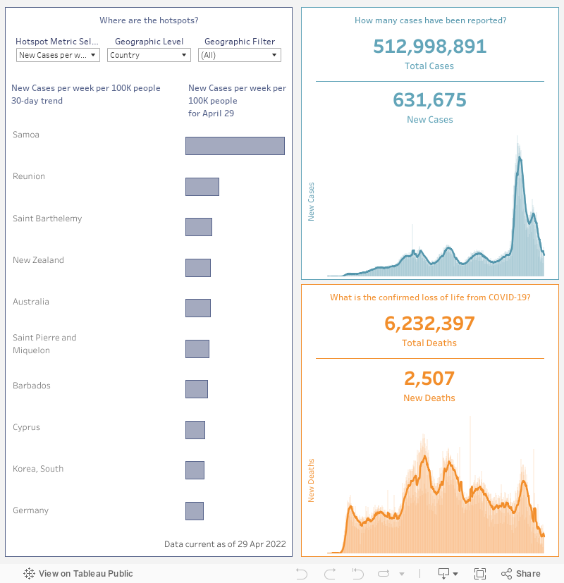
As revolutionaries in the field of data visualization, it comes of little surprise that Tableau has published data dashboards aimed at identifying hotspots and trends in the COVID-19 pandemic on a global scale. Tableau’ COVID-19 Data Hub1 is not only focused on visualizing these trends, but also helping to connect data users to powerful datasets published by the University of Oxford, The University of Washington, and The COVID Tracking Project at The Atlantic. The dashboard below compares cases and deaths per capita globally, by state/providence (Canada and United States only), and by county (United States only). By hovering over aspects of the dashboard, users can see the rate of cases and deaths per one-hundred thousand people within the past 30 days. The right-hand portion of this dashboard focuses on the total number of cases/deaths since the beginning of the pandemic as well as the incidence of cases/deaths at the current day.
Johns Hopkins University & Medicine has been a leading force in the visualization of COVID-19 data since the pandemic first began. Their Coronavirus Resource Center2 houses a multitude of data driven dashboards that examine both
testing and tracking data that are updated daily. The interactive map of the United States produced by the Johns Hopkins Centers for Civic Impact below gives viewers a full picture of the COVID-19 pandemic within the U.S. In this single dashboard
we can see total number of cases and deaths as well as cases and deaths per capita, all at the county level. The dashboard also highlights counties that are leading in confirmed COVID-19 cases and deaths. To get more detail on a county of interest,
click on a county of interest and a tooltip will appear with a COVID-19 status report. In these county status reports you will find more detail on the county’s demographic makeup, hospital capacity, and COVID-19 case and death information.
County level health departments have also been leveraging data visualizations to help communicate the effect COVID-19 has had on their community members. A shining example of this has come out of Allegheny County. The below dashboard housed on the Allegheny County Health Department’s website3 shows a comprehensive view of the COVID-19 situation within the county, highlighting cases, deaths, tests administered, hospitalizations, and ICU admissions. The creators of this dashboard also accounted for differences in demographic groups, allowing viewers to see results stratified by age group, gender, race, and residential zip code. Another impactful aspect of this dashboard can be found in the lower half of the visual. Here viewers can see that not only confirmed cases are being captured, but also probable cases are included in cases by day and deaths by day bar graphs. Including these probable cases accounts for individuals who showed symptoms of COVID-19 and were in contact with someone who tested positive for COVID-19 but did not have a positive test result themselves. Including these probable cases helps to show a more accurate assessment of the county’s status. Despite being packed with compelling data, in the lower right-hand corner the dashboard links viewers to a more detailed look at the definitions/methodology used, testing data, cases data, and rates by demographics.
Conclusions
With so much misinformation surrounding the COVID-19 pandemic, it is crucial to stay informed and more importantly, to listen to the data. When exploring any type of data dashboard or viewing a figure, as always, it is important to verify that
the data is being derived from a trusted source. Becoming more comfortable with interpreting data visualizations, will allow us to make better informed decisions in the workplace or even in our personal lives.
Additional COVID-19 Data Visualizations Examples
Centers for Disease Control and Prevention (CDC): COVID Data Tracker4
World Health Organization (WHO): Coronavirus Disease (COVID-19) Dashboard5
Johns Hopkins University & Medicine: Testing Trends Tool6
Johns Hopkins University & Medicine: Impact of Opening and Closing Decisions by State7
Pennsylvania Department of Health: COVID-19 Data for Pennsylvania8
Philadelphia Health Department: COVID-19 Overview9
UNC-Chapel Hill: COVID-19 Tracking11
The State University of New York: COVID-19 Case Tracker12
References
- COVID-19 (Coronavirus) data resource hub. Tableau website. https://www.tableau.com/covid-19-coronavirus-data-resources. Accessed October 30, 2020.
- COVID-19 United States cases by county - Johns Hopkins Coronavirus resource center. Johns Hopkins Coronavirus Resource Center website. https://coronavirus.jhu.edu/us-map. Accessed October 30, 2020.
- COVID-19. Allegheny County Health Department website. https://www.alleghenycounty.us/Health-Department/resources/COVID-19/Covid-19.aspx. Accessed October 30, 2020.
- CDC COVID-19 data tracker. Centers for Disease Control website. https://covid.cdc.gov/covid-data-tracker/#cases_casesinlast7days. Accessed October 30, 2020.
- WHO Coronavirus disease (COVID-19) dashboard. World Health Organization website. https://covid19.who.int/. Accessed October 30, 2020.
- Testing trends tool. Johns Hopkins University website. https://coronavirus.jhu.edu/testing/tracker/overview. Accessed October 30, 2020.
- Impact of opening and closing decisions by state. John Hopkins University website. https://coronavirus.jhu.edu/data/state-timeline. Accessed October 30, 2020.
- COVID-19 in Pennsylvania. Pennsylvania Department of Health website. https://www.pa.gov/covid/. Accessed October 30, 2020.
- Coronavirus Disease 2019 (COVID-19): Testing and data. City of Philadelphia website. https://www.phila.gov/programs/coronavirus-disease-2019-covid-19/testing-and-data/#/. Accessed October 30, 2020.
- COVID-19: Data. New York City Health website. https://www1.nyc.gov/site/doh/covid/covid-19-data.page. Accessed October 30, 2020.
- UNC-Chapel Hill CV-19 dashboard. Carolina Together: The University of North Carolina at Chapel Hill website. https://carolinatogether.unc.edu/dashboard/. Accessed October 30, 2020.
- SUNY COVID-19 case tracker. The State University of New York website. https://www.suny.edu/covid19-tracker/. Accessed October 30, 2020.
- Welcome to the COVID-19 data hub. Tableau website. https://www.tableau.com/covid-19-coronavirus-data-resources. Accessed October 30, 2020.
Biography Kate Verstreate is the
Data Project Manager of the Policy and Analytics Center (PAC) at the AJ Drexel
Autism Institute. Ms. Verstreate’s work focuses on analyzing administrative
health data as well as visualizing data across PAC projects. Ms. Verstreate
holds a Bachelor of Science in Human Biology from the University at Albany and
a master’s degree in Public Health with a concentration in Epidemiology from
the University at Albany School of Public Health. Contact Information Kate Verstreate, MPH: Data Project Manager, Policy and
Analytics Center A.J. Drexel Autism Institute
Whitaker | 56-66
Volume 9 ► Issue 3 ► 2020
Using Community Data to Inform Services
Julie Whitaker
Introduction
We live in a world that is focused on and driven by data. Sports, education, healthcare, and entertainment all benefit from the power of data to tell compelling stories and provide customized experiences. There are numerous data-driven resources available that can help organizations provide targeted services to their members, including several that could help Pennsylvania’s Office of Developmental Programs (ODP) make informed decisions to strengthen services for Pennsylvanians with disabilities. In this article, I will highlight free sources of data and data visualizations (Walk Score, the American Community Survey, and DataUSA) and provide suggestions on how to capitalize on them.
Walk Score1
 Walk Score is a website
that provides information about transportation, entertainment, shopping, safety, housing, and community amenities. It rates locations based on their walkability, bikeability, and public transit options. It is easily searchable- simply enter a town,
city, or exact address in the search bar at the top of the homepage of walkscore.com
Walk Score is a website
that provides information about transportation, entertainment, shopping, safety, housing, and community amenities. It rates locations based on their walkability, bikeability, and public transit options. It is easily searchable- simply enter a town,
city, or exact address in the search bar at the top of the homepage of walkscore.com
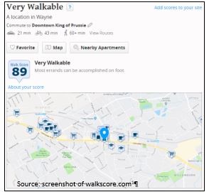 After the search, the results are presented on a one-page site
with interactive maps. The site allows you to search distances between housing options and grocery stores, cafes, and public transportation opportunities. It also gives a brief history of the area/town.
After the search, the results are presented on a one-page site
with interactive maps. The site allows you to search distances between housing options and grocery stores, cafes, and public transportation opportunities. It also gives a brief history of the area/town.
How can this be used?
The community data provided by Walk Score can be used in a variety of ways:
- Include Walk Score data in informational flyers for ODP participants and their families who are new to Pennsylvania.
- Suggest providers use Walk Score to create welcome brochures for new members which identify important community resources and provide options on how to get there.
- Inform ODP staff about employment, housing, education, and healthcare gaps and opportunities in communities across Pennsylvania.
- Information can also be used to frame dialogue about challenges and be considered when developing solutions.
The American Community Survey
The American Community Survey (ACS) is a demographic survey that is conducted by the U.S. Census Bureau. Unlike the Census, which is conducted every 10 years, ACS surveys a representative sample of the U.S. population every year. The American Community
Survey data is comprehensive, but thankfully easily searchable. It provides data tables that present disability-specific data.
The easiest way to find disability-related information in the ACS is by going to the Subject Tables section of the ACS using this link:
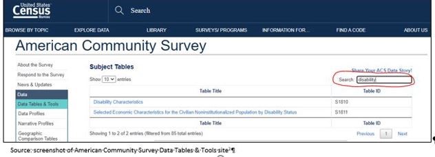
https://www.census.gov/acs/www/data/data-tables-and-tools/subject-tables/. Typing the search term “disability” in the tables search bar will yield results directly related to disability characteristics.
Table S1810, “Disability Characteristics,” is a good starting point to get basic information about numbers of individuals with disabilities nationally, in Pennsylvania, or in a county therein. Data included in this table include race information, age distribution, and number and percentage of individuals in each disability category.
After selecting the Disability Characteristics table, you can customize the information presented in the table to Pennsylvania or a county in Pennsylvania by clicking the “Customize Table” button. It will show options to fine tune the table to your specifications,
with the “Geographies” button being the most relevant:
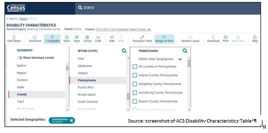
Though I have only shown how to get the table to focus in by county in this image, it is also possible to gather information specific to zip codes, state legislative districts, urban areas, school districts, and more. Once you have decided which of
geographic area to focus on, be sure that the table being shown is the most up-to-date ACS 5-year estimate, since the sample size is larger and will provide the most statistically precise information. To select this option, there is a drop-down menu
labeled “Product” and various options will appear, like in the image below:
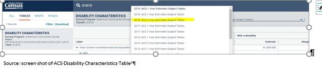
The ACS has another table that contains disability data available, Table S1811 “Selected Economic
Characteristics for The Civilian Noninstitutionalized Population By Disability
Status.” Using the same process as above (clicking customize table, customizing geography, and then using the “Product” drop-down menu to choose 2018: ACS 5-Year Estimates Subject Tables), you can explore data related to employment status, earnings,
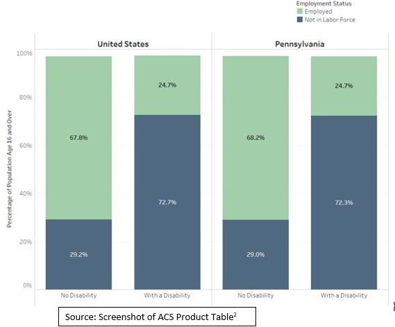
graduation rates, and even poverty status. This data can be employed to visualize educational attainment, earnings, and employment of individuals with disabilities as compared to individuals without disabilities. Furthermore, data can be used to make
comparisons to national trends or create county-to-county comparisons:
How can ACS Data be used?
- Inform discussions around program priorities and funding. For example, if the data show that population of adults with cognitive disabilities is greater than the population of children with disabilities, ODP may consider investing more resources in developing adult program options.
- Create visualizations of employment, salary, educational attainment, age distribution, and disability type across Pennsylvania to help support policy recommendations and program focus.
- Educate staff, participants, families, providers, and other stakeholders about successes and areas of opportunities for individuals with disabilities in Pennsylvania, counties, and other geographies.
DataUSA
 An article about free data sources would not be complete without mentioning the comprehensive and visually compelling DataUSA.io site. Created by Deloitte and Datawheel, DataUSA uses a variety
of federal data sources (including the ACS!) to create understandable and attractive visualizations on a variety of topics including sports, tobacco use, air transportation, wages, occupations, education, and more at the national, state, and county
level. There are hundreds of topics to explore, but I will be focusing on how the Pennsylvania-specific data can be used to educate and support ODP initiatives and programs.
An article about free data sources would not be complete without mentioning the comprehensive and visually compelling DataUSA.io site. Created by Deloitte and Datawheel, DataUSA uses a variety
of federal data sources (including the ACS!) to create understandable and attractive visualizations on a variety of topics including sports, tobacco use, air transportation, wages, occupations, education, and more at the national, state, and county
level. There are hundreds of topics to explore, but I will be focusing on how the Pennsylvania-specific data can be used to educate and support ODP initiatives and programs.
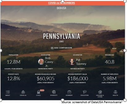
The data and visualizations can be accessed by clicking the icons at the bottom of the Pennsylvania’s informative landing page. For example, after clicking diversity one is led to the following visualization about Pennsylvania’s population characteristics:
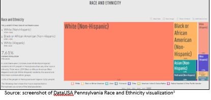 The data visualization goes back a few years to show population trends over time. State level information is available about numerous topics including population characteristics, education opportunities, voting behavior, and community health.
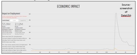
DataUSA has also provided COVID-19 data and visualizations in the COVID-19 in the United States portion of their website. Though there is a slight lag in the data, it produces visualizations that show new cases, community mobility, economic impact, ICU bed availability, and risk and readiness in the United States as a whole and by state.
How can DataUSA be used?
- Include attractive visualizations in training and other organizational materials to help support policy recommendations and justify program changes.
- Educate staff, participants, families, providers, and other stakeholders about successes and areas of opportunity for improving quality of life in Pennsylvania.
- Keep participants, families, providers, and other stakeholders up to date on the latest COVID-19 numbers.
- More easily employ data to educate participants, families, ODP staff, and providers on important topics affecting their communities and state.
Final Thoughts
Data provides us with opportunities to learn and teach others about the communities in which we live. It can help inform training curriculum for professionals; educate participants, families, and providers about community resources; and inform policy changes. Using data in publications to help families settle into a new place can lead them to make the best housing and employment decisions for their family. Showing data trends over time can help answer the “why” of a big change that may be necessary at the organizational level. Presenting data in visually appealing ways can help people understand it better. When using data from these websites, it’s important to cite your sources each time, which gives credit to the organization for having gathered the information and/or created the visualization. Examples of simple ways to do this can be seen in the visuals throughout this article.
References
1. Wayne, Pennsylvania. Walk Score website. Updated 2020. https://www.walkscore.com/score/124.dash.130-w-lancaster-ave-wayne-pa-19087
Accessed September 28, 2020.
2. Understanding and Using American Community Survey Data: What All Data Users Need to Know. Disability Characteristics (Table S1810). Selected Economic Characteristics for the Civilian Noninstitutionalized Population by Disability Status (Table S1811). American Community Survey, U.S. Census Bureau website. https://www.census.gov/programs-surveys/acs/guidance/handbooks/general.html, https://data.census.gov/cedsci/table?q=S1810&tid=ACSST1Y2019.S1810, https://data.census.gov/cedsci/table?q=S18&d=ACS%201-Year%20Estimates%20Subject%20Tables&tid=ACSST1Y2019.S1811. . Updated 2020. Accessed September 27, 2020.
3. Pennsylvania. DataUSA website. https://datausa.io/profile/geo/pennsylvania. Updated 2020. Accessed September 28, 2020
Biography
Julie Whitaker is a project coordinator at the A.J. Drexel Autism Institute. Prior to joining the Autism Institute in April 2020, she worked as a research and project specialist at the Arizona Developmental Disabilities Planning Council, where she focused on educating the policy makers and community members about health, safety, transportation, self-advocacy, and policy issues.
Contact Information
Julie Whitaker
Project Coordinator
A.J. Drexel Autism Institute
Wong | 67-75
Volume 9 ► Issue 3 ► 2020
Social Work Values in Action: Using Data to Meet People Where They Are
Mi-Yeet Wong, LCSW
Introduction
As a social worker, you may have come across people who are unsure or have misconceptions about what you do. In part, this may be because of the misperception of social workers in the media1. To be clear, we do not snatch babies and tear families apart. We do, however, use our social work values to guide our support of individuals, families and communities in a myriad of settings, systems, and roles within which we function. With the reality that we are contending with limited resources and time, and that many of our clients may need support across the lifespan, the use of data to inform planning and to allocate supports is becoming increasingly important. This article will provide information on the guiding principles of social work, the social work workforce and highlight examples of ways that data has been used to meet people where they are.
What Social Workers Do
Social work practice is “the professional application of social work values, principles, and techniques to one or more of the following ends: Helping people obtain tangible services; counseling and psychotherapy with individuals, families, and groups; helping communities or groups provide or improve social and health services; and participating in legislative processes.”2 Social workers are guided by a core set of values, principles, and ethics. These core values include service, social justice, dignity and worth of the person, importance of human relationships, integrity, and competence.3
Social Work Workforce
Since social workers practice in a variety of settings, such as mental health clinics, hospitals, child welfare systems, managed care organizations, private practices, and more, it is no wonder that the social work profession is projected to grow 13% from 2019 to 2029. In comparison, the average growth rate for all occupations is 4%.4 Pennsylvania has one of the highest population of social workers nationally.5 You can look at data from the map below to gain a better understanding of the concentration (or lack of) social workers by county or state5.
Spatial Concentration Map
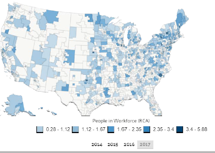
Exploring the demographics of social workers can also paint a picture of the racial and gender makeup between social workers and the populations they serve. Because social workers practice with different types of populations (child and family social workers, school social workers, healthcare social workers, and more), gaining a better understanding of the workforce capacity helps to identify areas where there is a shortage of social workers relative to needs. In addition to using data to better understand workforce capacity, social work practice transcends various systems, ultimately placing them at a pivotal role to utilize integrated data systems.
Integrated Data Systems Support Better Service
Social work practice is guided by Service, drawing on social workers’ knowledge, values, and skills to help people in need and to address social problems.3 Integrated data systems elevate service in powerful ways. It can streamline information across systems to avoid wasted time and frustration for families having to complete yet another similar form with intake questions. It allows different systems to become aware of the services that an individual receives, lessening the burden on a family to navigate. It provides a way to offer truly comprehensive care, avoiding duplication of services.
Social workers work with individuals who experience multiple barriers and consequently, have interactions across various systems. As a social worker, how can I say I am meeting people where they are, without acknowledging that they come with complex needs? If an individual is having trouble paying for their electricity bill, it is likely that they may also have trouble sustaining and having their basic needs met. The cycle of poverty does not end when one need is addressed. Therefore, it is imperative that we begin to integrate data to reflect all of the various systems, services, and supports that our clients touch.
Disparity in resources across neighborhoods, compounded by barriers that individuals face, can further complicate access to support. An example of where the use of integrated data across systems has helped to further support families with complex needs
is the Allegheny County Data Warehouse6. By consolidating publicly-funded human services data (behavioral health, child welfare, intellectual disability, homelessness, and aging), the Data Warehouse allowed for the analyses of school absenteeism
among students who had DHS involvement.6 As a result of this partnership between the Data Warehouse and Pittsburgh Public Schools, the development of programs and policies were prioritized to help students improve their grades and attendance.
Consequently, this information led to conversations and collaborations across professions – county judges, social workers, child welfare case workers, and more. Caseworkers can gather as much information as possible in preparation for responding to
potential maltreatment, identify whether families are receiving other public benefit supports, whether family members have had interactions with the criminal justice system, or have received drug or alcohol treatment. In some cases, it has even helped
with the identification of relatives to support the child or family. An investment in integrated data systems is an investment in supporting families and the workers that they come into contact with, in an efficient, cost-saving way.
Another example can be found in Philadelphia, where the City of Philadelphia CARES data was used to strategically identify areas that needed Pre-K education the most.7 Utilizing administrative data that collected and linked information from multiple agencies, thy identified areas where children who had multiple risks lived. Data was collected from Pre-K programs across the city to learn about their capacity. Overlaying this data with the map of where children had multiple risks, resulted in the identification of target areas that needed more quality Pre-K availability. One of the impactful results from this integrated data system was the increase of Pre-K capacity in the Kingsessing area by 113%. While this is one example of the use of an integrated data system to serve children most in need of these educational programs, this also has implications for families who can be connected to needed social support services earlier, such as nutritious food, parent training and family support.
What is the Dignity and Worth of a Person?
One of the guiding principles of social work practice is the dignity and worth of a person. This principle is especially important in your practice, as there can be feelings of shame that accompany poverty. Shame is internalized and can also make someone hesitate to reach out for help. Knowing that there are pockets where people are struggling to have their basic household needs met, such as having plumbing and a functional kitchen, also means that those families are struggling to maintain other needs. Social workers can use this data to better target fundamental resources in high-need areas.
For example, Indiana County has the highest percentage of households lacking both complete kitchen facilities and complete plumbing facilities8.
Kitchen and Plumbing Map
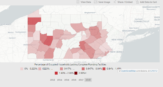
Looking further into Indiana County can paint a picture of the poverty that residents are experiencing. With the median annual income at $46,306, it is less than the median annual income of $61,937 across the entire United States.8 16.6% of the population live below the poverty line, which is higher than the national average of 13.1%. The largest demographic living in poverty in Indiana County are males 18-24, followed by females 18-24 years old. Yes, social workers can impact lives by making sure that these families are connected with basic needs to live. But social workers can also save lives by providing the psychological support and validation for a family, so that they don’t feel judged when seeking help. The burden of poverty on an individual can be tremendous, and the impact on a family and communities can be generational.
Social work practice is guided by values and principles. The heart of the role requires collaboration across agencies and systems, with the goal of ensuring that individuals, families and communities’ needs are not only being met, but that things can get better. Data can be used as a powerful tool to help get us there.
References
1. Veigel R. Community perception of social workers. Presented to the Faculty of the Graduate School of the University of Texas at Arlington in Partial Fulfillment of the Requirements for the Degree of Master of Science in Social Work. 2009. doi: 10.1.1.628.3476&rep=rep1&type=pdf
2. Practice. National Association of Social Workers website. https://www.socialworkers.org/Practice. Accessed September 29, 2020.
3. Read the code of ethics. National Association of Social Workers website. https://www.socialworkers.org/About/Ethics/Code-of-Ethics/Code-of-Ethics-English. Accessed September 29, 2020.
4. Occupational outlook handbook, social workers. U.S. Bureau of Labor Statistics website. https://www.bls.gov/ooh/community-and-social-service/social-workers.htm. Last modified September 9, 2020. Accessed September 29, 2020.
5. Social workers. Spatial Concentration. Data from the Census Bureau ACS PUMS 1 year Estimate. Data U.S.A website. https://datausa.io/profile/soc/social-workers. Accessed on September 29, 2020.
6. Kitzmiller EM. IDS Case study: Allegheny county’s data warehouse: Leveraging data to enhance human service programs and policies. Actionable Intelligence for Social Policy. https://www.aisp.upenn.edu/wp-content/uploads/2015/08/AlleghenyCounty-_CaseStudy.pdf. Accessed September 29, 2020.
7. LeBoeuf W, Barghaus K, Henderson C, Coe K, Fantuzzo J, Moore J. The use of integrated data to inform quality pre-k expansion in Philadelphia. Research Briefs. 2017;1. http://repository.upenn.edu/pennchild_briefs/1. Accessed September 29, 2020.
8. Indiana County, USA. Data U.S.A website. https://datausa.io/profile/geo/indiana-county-pa. Accessed September 29, 2020.
Biography
Mi-Yeet Wong, LCSW works on the Philadelphia Autism Project and the Autism Services, Education, Resources and Training Collaborative (ASERT) Collaborative Eastern Region at the Policy and Analytics Center, A.J. Drexel Autism Institute. At the Philadelphia Autism Project, Ms. Wong provides support on citywide initiatives that connect individuals on the spectrum and their supporters with resources and innovative programs. At the ASERT Collaborative Eastern Region, she works on projects driven by priorities across PA communities and the Bureau of Supports for Autism and Special Populations (BSASP), Office of Developmental Programs (ODP).
Ms. Wong uses her prior experience as a Case Manager for adults with developmental differences to contribute to her current work in supporting individuals, their family members and the community.
Contact Information
Mi-Yeet Wong, LCSW
A.J. Drexel Autism Institute
Closing | 76-83
Volume 9 ► Issue 3 ► 2020
Closing
As we strive to find better and best ways to think about, use and display data to make policy and practice decisions in our fields, we hope that you found a tool or resource that will support your work. There are many uses of data that were not covered
in this issue of Positive Approaches. To help continue to enrich and support your ideas for using data, below is a list of resources you can explore further. We look forward to the next Data Issue of Positive Approaches and, as always, we welcome
your feedback.
- Lindsay Shea, MS, DrPH and Kate Verstreate, MPH
Resources