Positive Approaches Journal, Volume 9, Issue 3
Koffer-Miller | 20-27

Volume 9 ► Issue 3 ► 2020
Words are Data Too! Options for Analysis and Visualization
Kaitlin H. Koffer Miller, MPH
Introduction
When the word “data” is used, it informally conjures an image of Excel sheets, strings of numbers, bar graphs, and scatter plots. But that is only one form of data: quantitative data. Quantitative data are numeric and can be counted, measured, and analyzed for cause and effect.1 Qualitative data, on the other hand, are non-numeric and can be analyzed to understand context and meaning of themes, opinions and perspectives.2 Qualitative research by nature, “…is interactive: context dependent; holistic; flexible; evolving; inductive and descriptive. It has as its foci, perspectives, meanings, uniqueness, and subjective live experiences. Its aim is to provide understanding”. 3 Qualitative data is most useful when you are trying to learn more about a specific issue and trying to gain a deeper understanding beyond counts and other numeric measurement.
Qualitative data can be collected from a myriad of qualitative methods including interviews, focus groups, and surveys. Interviews are one of the most commonly used qualitative methods and can be structured, semi-structured, or unstructured. 4 Structured and semi-structured interviews rely on a set of questions that the interviewer asks the respondents while the less commonly used unstructured interviews “…resembles a conversation more than an interview”.4 Focus groups are similar to an interview, but with a group of around six-twelve people participating in a semi-structured discussion facilitated by a session moderator. 4, 5 Surveys can have both quantitative and qualitative components, meaning that a survey can include questions that can be counted (e.g. the number of providers who offer a certain service, a scale of how satisfied staff are with a communication strategy) or questions that are more free-text in nature and offer a space for respondents to freely share their thoughts (e.g. a text box for suggestions for future training topics).6
In all of these qualitative methods, the common thread is that the words reported by interviewees or focus group participants, either written or spoken and transcribed, are the data. Exploring and effectively displaying words as data can be a tremendous tool to better understand issues of interest.
Exploring Words as a Data Source
There are many ways to explore and begin to understand words or “textual data”. One way is called “coding”. Once you have your textual data (e.g. transcriptions from audio recordings of interviews or focus groups, free text responses from a survey), you are ready to explore. Coding is essentially looking for themes in the data assigning words or phrases to quotes, passages, or other aspects of your textual data.7 For example, if you have a quote from an interview about office processes that states, “I think that the emails we get are too long”, you may code that as “Email Length”, “Emails too long”, or if you think you could not have said it better yourself you could code it as “I think that the emails we get are too long”. This typing of coding is called “in vivo” coding.8 Your codes can be in whatever style you and your team find most helpful to understand. Coding can be done in many ways using many methods and types of software. You can either pre-determine codes (deductive coding) or determine codes as you read your textual data source (inductive analysis).7, 8 This can be done using a paid qualitative analysis software like NVivo or Dedoose or even using highlight and the comment functions in word processing software like Microsoft Word.
Once you read through and assign codes to all of your textual data, you will have a list of codes that are the themes. You can consolidate your codes into a smaller set of themes if you have some codes that are similar.8 For example, if you have codes from a survey completed by staff about training needs and you have a set of codes like “Sexuality,” “Sexual Relationships,” “Dating,” and Relationships” you may want to group all of those codes into one code called “Sexuality and Relationships” to encompass all of the text that related to those topics. This will help you have a smaller number of themes to describe. Once you have gone through the exercise of consolidating your codes into themes, you will have a list of themes and be able to see how many times that theme was discussed, by how many people, and how it related to or was discussed or mentioned with other themes.
You can also look at word frequency in your textual data. This process is more simplistic than coding the content for themes.9 Word frequency is counting the amount of times that a word appears in the data source.9 Similar to coding, word frequency counts allow you to determine themes based on the number of times a word appears in your source (e.g. transcript or compilation of free text survey responses). Like coding, this can be done using paid qualitative analysis software or using programs like Microsoft Word or Excel. You could use your findings to report on as themes (to be described later) or as a springboard to look into specific themes more deeply. For example, if the word “support” comes up frequently in a series of interviews about family engagement with home and community based services, you may want to look more specifically at how the word “support” was being used and if there are more than one type of support being discussed. Perhaps your second review reveals a discussion of formal support versus informal support and you would want to report on these two findings separately.
Data Visualizations for
Words
There are many ways to use visualizations to effectively display your findings from your textual data. Word clouds are an excellent way to visualize words as a data source. Similar to word frequency analysis, word clouds allow you to “quantify” your
textual data “…to increase comprehension and accessibility through visualization of the written responses”.10 Word clouds are a visualization that increase the size and/or boldness of a word based on the number of times it appears in the
data source (e.g. free response text from a survey or interview transcript).10 This allows viewers to easily interpret and understand what were commonly reported ideas, thoughts, or themes from your survey, interviews, or focus groups.
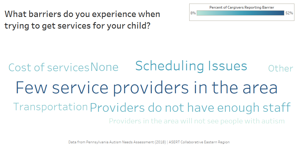
Word clouds can be done using paid software like Tableau, a data visualization software, or in free online options like Wordle. The following example of a word cloud (Figure
1 below) has been created in Tableau using responses from a question about barriers to services as reported by family members and caregivers of autistic individuals from the 2018
Pennsylvania Autism Needs Assessment. This word cloud shows that “few service providers in the area,” “scheduling issues,” and “providers do not have enough staff” were commonly reported barriers to services by family members and caregivers of autistic
individuals. While this data could have been described in a narrative form or using percentages, the word cloud provides a visual opportunity to easily displace your textual data in a report or presentation.
Figure 1: Tableau Word Cloud Example
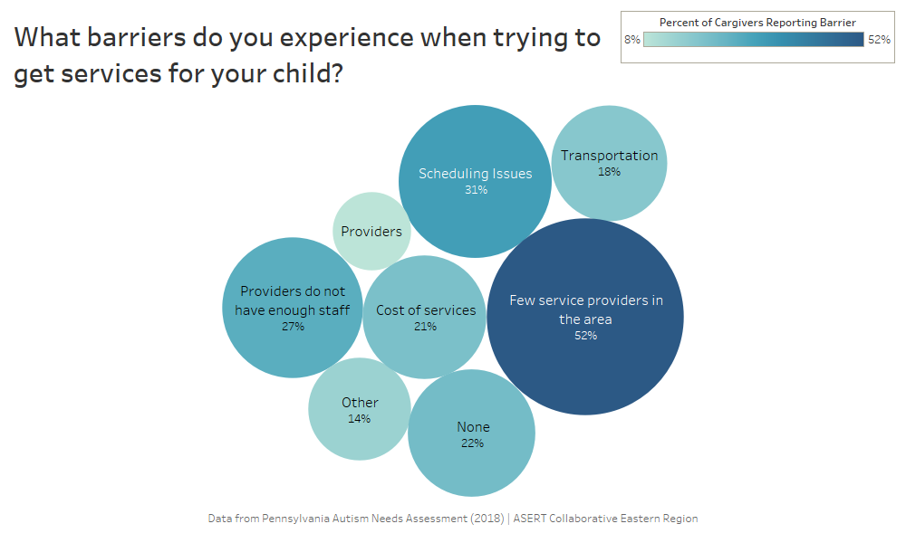
Another data visualization to display your textual data, like a word cloud, is a bubble graph. The word map uses the size of a bubble and includes a frequency (like a percentage) to display words, themes, ideas, or concepts that were most frequently reported in your data source. Word maps can be done in paid software like Tableau or using a word processing software like Microsoft Word or a presentation tool like Microsoft PowerPoint, however the visualizations you would create by hand in Word or PowerPoint would not have the same precision of size and shape as Tableau which would automate this based on the data. The following example (Figure 2 below) uses the same textual data from the 2018 Pennsylvania Autism Needs Assessment about services barriers. This data visualization again provides an easily interpretable way to see what is commonly reported by respondents, interviewees, or focus group respondents.
Figure 2: Tableau Data Visualization Example
Conclusions
There are many options for you to analyze, interpret, and visualize your textual data from surveys. Once you have collected your textual data, it is important to ensure that your findings are easily translated and viewed by your audience. Qualitative research and analysis of textual data can often be displayed in cumbersome narrative reports that do not captivate readers or viewers, but data visualization can be created using free and paid tools that can enhance and sophisticate the way that you present textual data. When coupled with longer quotes extracted from your data sources, data visualization like word clouds and bubble graphs can bring your analysis to the next level and remind your readers, colleagues, or audience that words are data too!
Reference
1. Australian Bureau of Statistics: Quantitative and Qualitative Data. https://www.abs.gov.au/websitedbs/a3121120.nsf/home/statistical+language+-+quantitative+and+qualitative+data#:~:text=What%20are%20quantitative%20and%20qualitative,symbol%2C%20or%20a%20number%20code. Accessed 14 September, 2020.
2. Watkins DC. Qualitative research: the importance of conducting research that doesn’t “count”. Health Promot Pract. Mar 2012;13(2):153-8. doi:10.1177/1524839912437370.
3. Trudeau-Hern S, Daneshpour M. Cancer’s Impact on Spousal Health: A Qualitative Analysis in Grounded Theory. Contemporary Family Therapy. 2012;34(4):534-554.
4. Jamshed S. Qualitative research method interviewing and observation. J Basic Clin Pharm. Sep 2014;5(4):87-8. doi:10.4103/0976-0105.141942.
5. Koffer-Miller KH, Mathew M, Nonnemacher SL, Shea LL. Program experiences of adults with autism, their families, and providers: Findings from a focus group study. Autism. 2017; 22(3); 345-356. doi:10.1177/1362361316679000.
6. Fielding J, Fielding N, Hughes G. Opening up open-ended survey data using qualitative software. Quality & Quantity. 2012;47:3261–3276.
7. Braun V, Clarke V. Using thematic analysis in psychology. Qualitative Research in Psychology. 2006;3(2):77-101.
8. Creswell J, Poth C. Qualitative Inquiry and Research Design: Choosing Among Five Approaches. 4th ed. SAGE Publications, Inc.; 2018.
9. Ryan GW, Bernard HR. Techniques to identify themes. Field Methods. 2003;15(1):85-109.
10. Bletzer KV. Visualizing the qualitative: making sense of written comments from an evaluative satisfaction survey. J Educ Eval Health Prof. 2015;12:12. doi:10.3352/jeehp.2015.12.12.
Biography
Kaitlin Koffer Miller is the Regional Manager of the Autism Services, Education, Resources, & Training Collaborative (ASERT) Eastern Region at the AJ Drexel Autism Institute. Ms. Koffer Miller’s work focuses in policy research as well as qualitative data analyses. Ms. Koffer Miller holds a master’s degree in Public Health from the Dornsife School of Public Health at Drexel University and is a doctoral candidate in Health Policy at the Dornsife School of Public Health at Drexel University.
Contact Information
Kaitlin Koffer Miller, MPH
Regional Manager, ASERT Eastern Region
A.J. Drexel Autism Institute
Drexel University