
Positive Approaches Journal, Volume 8, Issue 4
Positive Approaches Journal | 6
Data Discoveries
The goal of Data Discoveries is to present useful data using new methods and platforms that can be customized.
Where you live matters
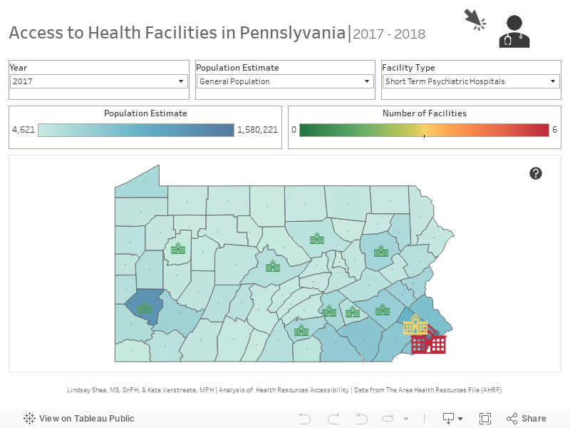
Pennsylvania is home to many diverse communities. From rural farmland to one of America’s largest (and poorest) cities, where you live is linked to what health resources and services you can access. In this issue of Data Discoveries, data from the Area Health Resource File (AHRF) is displayed by county to illustrate that where you live impacts access to the access to specific types of health care facilities and providers near you. The AHRF collects data from more than 50 sources to capture many different types of health care facilities and providers. The AHRF does not survey Pennsylvania data specifically and may be missing certain types of providers or facilities and pulls data from different years, which may also miss providers or facilities.
There are two components to the below data dashboard. The first component of the dashboard displays two layers of data. The first layer, estimates of the prevalence of autism spectrum disorder (ASD) and the prevalence of intellectual and developmental disabilities (ID/D), are indicated by the darkness of the county shading. Research from the CDC was used to generate these prevalence estimates by multiplying them by the size of the county population. A more darkly shaded county represents a higher prevalence of ASD and ID/D. The second layer of data from the AHRF is represented on the map by the symbols with the size and color of the symbol indicating how many facilities are located in the county. The second component of the data dashboard presents the AHRF data regarding number of medical providers by county. The rate of medical providers by 100,000 people is presented on the waffle chart.
The data dashboard below starts with the map of health care facilities – to filter the map by year, population estimate, and/or facility type use the filters along the top of the map. For definitions of the facility types, hover over the ‘?’ icon in the filter. Hover over each county or facility icon to see the number of facilities and the population estimates. To get to the medical provider waffle chart, click the medical provider icon in the top right-hand corner. The waffle chart can be filtered by county and/or medical professional type. The rate per 100,000 people will appear in the top left corner of the chart, to see more detail about the ASD/ID population hover over the people icons in the chart. To return to the facility map or explore more of the AHRF data on your own, use the icon buttons in the top right-hand corner.
Pennsylvania is home to many innovative health care providers and service models. As the 5th largest state in the US, the diverse needs of the state population may require individuals to travel to reach providers or facilities needed or to consider other health care options. One way to find out about services and providers in your area is to connect to local support groups. Find the maps of support groups in Pennsylvania here: https://paautism.org/support-groups/.