
Positive Approaches Journal, Volume 9, Issue 3
Merriweather | 28-33

Volume 9 ► Issue 3 ► 2020
Data Visualization: How to Use Graphics Effectively
Chisa Merriweather
Data can be an extremely powerful tool when its message is able to be clearly conveyed. Attempting to make large volumes of data more interesting, dynamic, and well-received by your audience is a technique called data visualization or data storytelling. Representing data in the form of visual context, such as a chart, table, graph, infographic, or a map, helps viewers understand the significance of that data. When done well, visualizations are able to shed light on obscure details that would normally be difficult to uncover in a typical spreadsheet or bar chart.
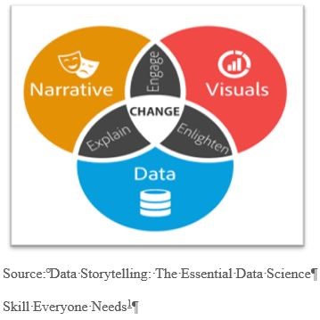
When crafting a story around data, it’s important to understand how to combine the right data, visuals, and narrative. There is a whole science behind designing effective digital visualization. For now, we’ll focus on 3 crucial elements to remember when creating data stories.
 1.
Focus on key points that stand out.
1.
Focus on key points that stand out.
2. Make smart design decisions.
3. Keep it simple.
Focusing on key points in data that stand out makes things easy for your audience.
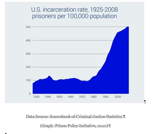
The ability to visualize differences and similarities between objects (such as size, orientation, or color) is naturally detected by the viewer. Visual metaphors, like a pyramid that displays hierarchy, or a scale used for the comparison of two things, also aid in providing a focus. The orientation and type of table used in the example below2 clearly indicates to the viewer that this information is important. At first glance, eyes are immediately drawn to the increase in U.S. incarceration beyond the year 2000.
Next, you want your data to be presented in its most optimized form but most of all make sense. To ensure the functionality of the data story, smart design decisions must be considered:
1. Colors should be deliberately assigned (example: blue means cold and red means hot)
2. The order or format in which the data is presented (numeric, alphabetical, or sequential) must make sense to viewers.
3. Make sure the data is viewable. Choose a san-serif font as opposed to serif font when plotting points with a point-size no smaller than 8 points.
Finally, keep it simple. The collective of data visualization is to convey a clear message. So, simplify your chart so that the main point is the highlight of the graphic. Here are a few easy ways to accomplish this:
- When using color make sure there’s a contrast between colors. Data may seem to blend when too many shades of a similar or one color is used.
- Remove any unnecessary copy, illustrations, drop shadows, etc.
- Avoid using 3D charts that risk skewing data perception
- Patterns such as stripes and polka dots used to highlight important data, are more distracting than helpful
- The less colors used the better. Limit the color pallet to 6 colors.
Data visualizations communicate data findings that may not translate clearly through a simple bar chart or line graph. When data and visuals are successfully combined, insight and interesting patterns within the data are suddenly revealed. Data storytelling engages, informs and above all has the potential to influence change.
For more examples of data visualizations:
Best Data Visualizations of 20194
References
1. Dykes B. Data storytelling: The essential data science skill everyone needs. Forbes. 2016. https://www.forbes.com/sites/brentdykes/2016/03/31/data-storytelling-the-essential-data-science-skill-everyone-needs/?sh=6b65b68652ad
2. US incarceration rate, 1925-2008. Prison Policy Initiative website. https://www.prisonpolicy.org/graphs/incarceration1925-2008.html. Accessed October 29, 2020.
3. Barnes S. The daily routines of famous creative people. MyModernMet website. https://mymodernmet.com/podio-daily-routines-famous-creative-people/. Published January 10, 2015. Accessed October 29, 2020.
4. Velarde Orana. The 25 best data visualizations of 2019. Visme website. https://visme.co/blog/best-data-visualizations/. Accessed October 29, 2020.
5. Splitting the apple: A simple guide to understanding Apple stock splkits. Ceros website. https://www.ceros.com/originals/apple-stock-splits-2020/?utm_campaign=Ceros%7COriginals%20Newsletter&utm_medium=email&_hsmi=94143119&_hsenc=p2ANqtz-9FeUCC9u5bMeNG3Jy8ZtL-W6NYqe81mrfFGHARnlF9e0SI_KoU4MDLDwgPNrJDulsRNi5W8EhE713yb24hkwuB7_ynN6enRcWBkhLKuELzO874qGU&utm_content=94144895&utm_source=hs_email. Accessed October 29, 2020.
6. Taylor P. Next America. Pew Research website. https://www.pewresearch.org/next-america/#Two-Dramas-in-Slow-Motion. Published April 10, 2014. Accessed October 29, 2020.
Biography
Chisa Merriweather is the Communications Specialist at AJ Drexel Autism Institute. Ms. Merriweather’s design work focuses on supporting projects for the Autism Services, Education, Resources, & Training Collaborative (ASERT) Eastern Region, Philadelphia Autism Project and the Policy and Antilytic Center. Ms. Merriweather holds a Bachelor of Fine Arts degree with a concentration in Graphic Design from West Chester University and a certificate in Social Innovative Design from the University of Pennsylvania.
Contact Information
Chisa Merriweather