
Positive Approaches Journal, Volume 9, Issue 3
Shea | 40-43

Volume 9 ► Issue 3 ► 2020
From the Vault: Uncovering Early Data Visualizations
Lindsay Shea, MS,
DrPH
Introduction
When we think of Florence Nightingale, most of us associate her with her founding role in how nursing has become a critical component of healthcare. Florence contributed substantively to the field of nursing through her dedication, working through the nights tending to wounded soldiers during the Crimean War. She also formed one of the first nursing schools in the world, which is today part of King’s College in London, United Kingdom (UK).
What many of us don’t know about Florence Nightingale is that she was a leading innovator in data visualization. She is credited with a new version of a pie chart, which had originally been developed by William Playfair in 1801. In the new use of the pie chart, Nightingale took data that was typically depicted as a bar chart and put it into a circular form to show how elements of data related to each other. This new pie chart, called a polar area diagram or Nightingale rose diagram was used to generate the diagram below where patient mortality in the military field hospital she managed occurred by month or season.
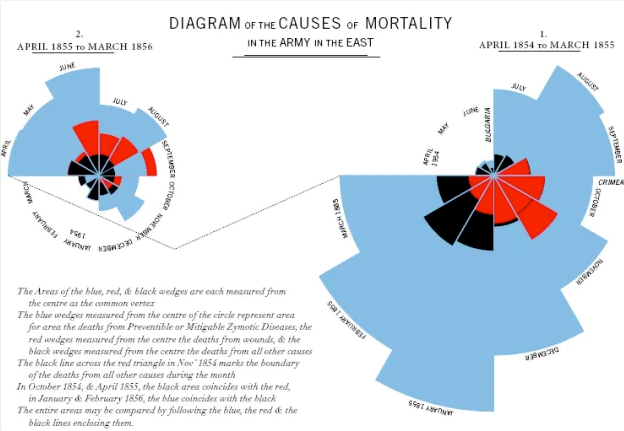 In this diagram1, mortality is tracked over time from April 1854 to March 1856, and two graphs are linked to display mortality patterns. In addition to her creativity in using data, Nightingale prioritized ways of organizing data to
ensure findings were thoroughly communicated and understood, without the use of a computer or statistical coding software. Nightingale used these polar area diagrams to present to Members of Parliament and civil servants who were not trained in
statistics to inform the course of medical care and military operations.
In this diagram1, mortality is tracked over time from April 1854 to March 1856, and two graphs are linked to display mortality patterns. In addition to her creativity in using data, Nightingale prioritized ways of organizing data to
ensure findings were thoroughly communicated and understood, without the use of a computer or statistical coding software. Nightingale used these polar area diagrams to present to Members of Parliament and civil servants who were not trained in
statistics to inform the course of medical care and military operations.
Nightingale would go on to use data visualizations to create new ways of reporting on air and water quality issues and their impact on health. Nightingale was the first female member of the Royal Statistical Society and, in 1874, she was named an honorary member of the American Statistical Association.
More than 150 years have passed since Nightingale’s polar area diagrams. Data visualization has continued to grow and emerge in new ways. By looking back into history as well as observing opportunities for data visualization all around us today, we can all contribute to new ways of using and communicating data.
Reference
1. Online Journalism Blog, 2014. Florence Nightingale and Crimean War Deaths. Is there a ‘canon’ of data journalism? Comment call!. Available at: https://onlinejournalismblog.com/2014/05/20/is-there-a-canon-of-data-journalism/ Accessed October 1, 2020
Biography
Lindsay Shea is working on efforts in Pennsylvania and beyond to implement data visualization as a way to understand and navigate the world around us. She has led research projects in Pennsylvania and nationally to identify individuals on the autism spectrum who are served across systems and specifically in the Medicaid system. Her research interests include understanding disparities in service access and use across the lifespan, especially in publicly funded safety net programs.
Contact Information
Lindsay Shea, MS, DrPH